The power of the X
ChildX
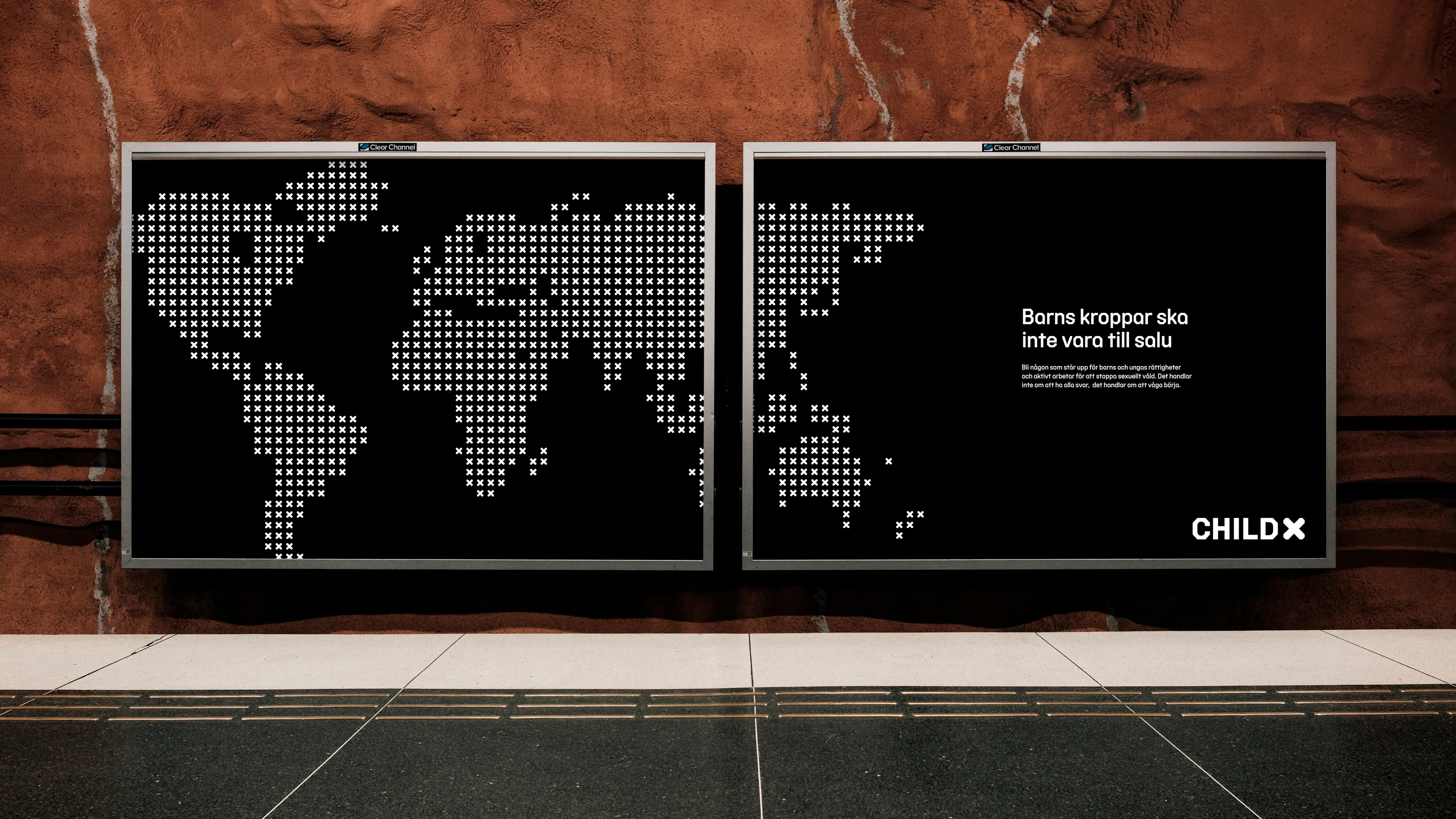
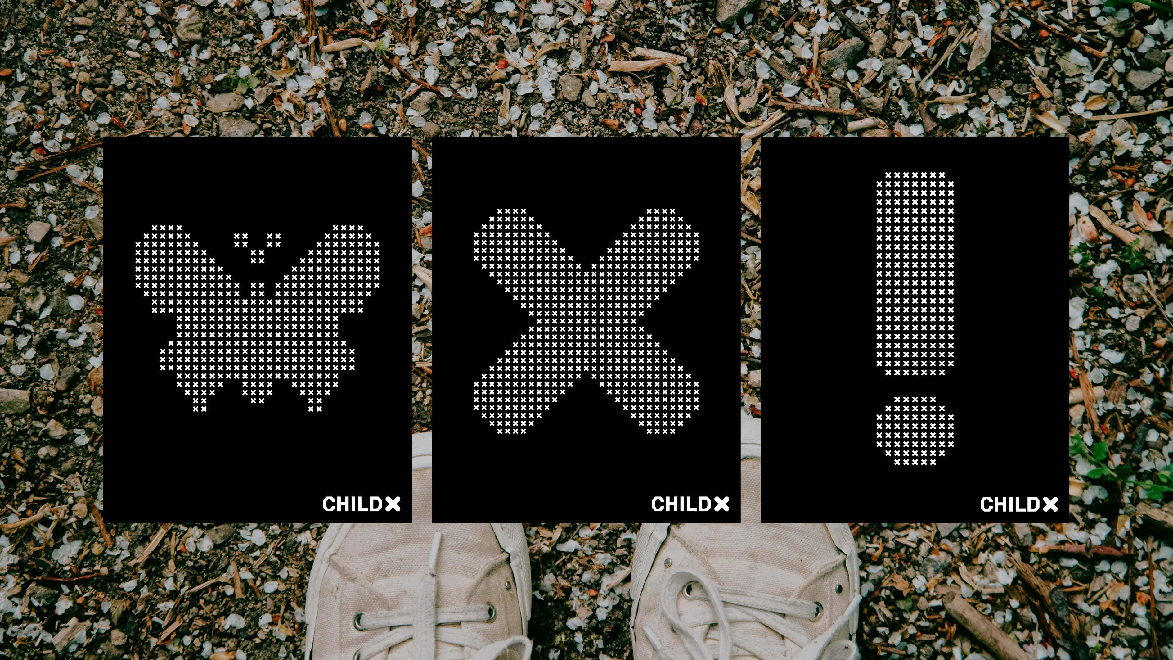
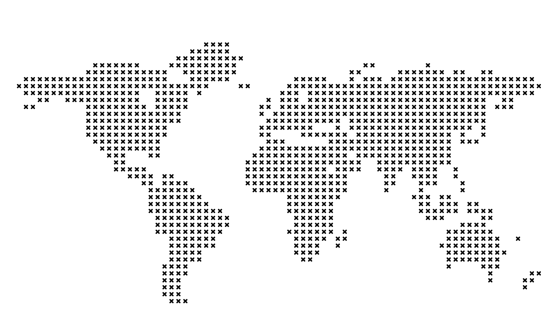
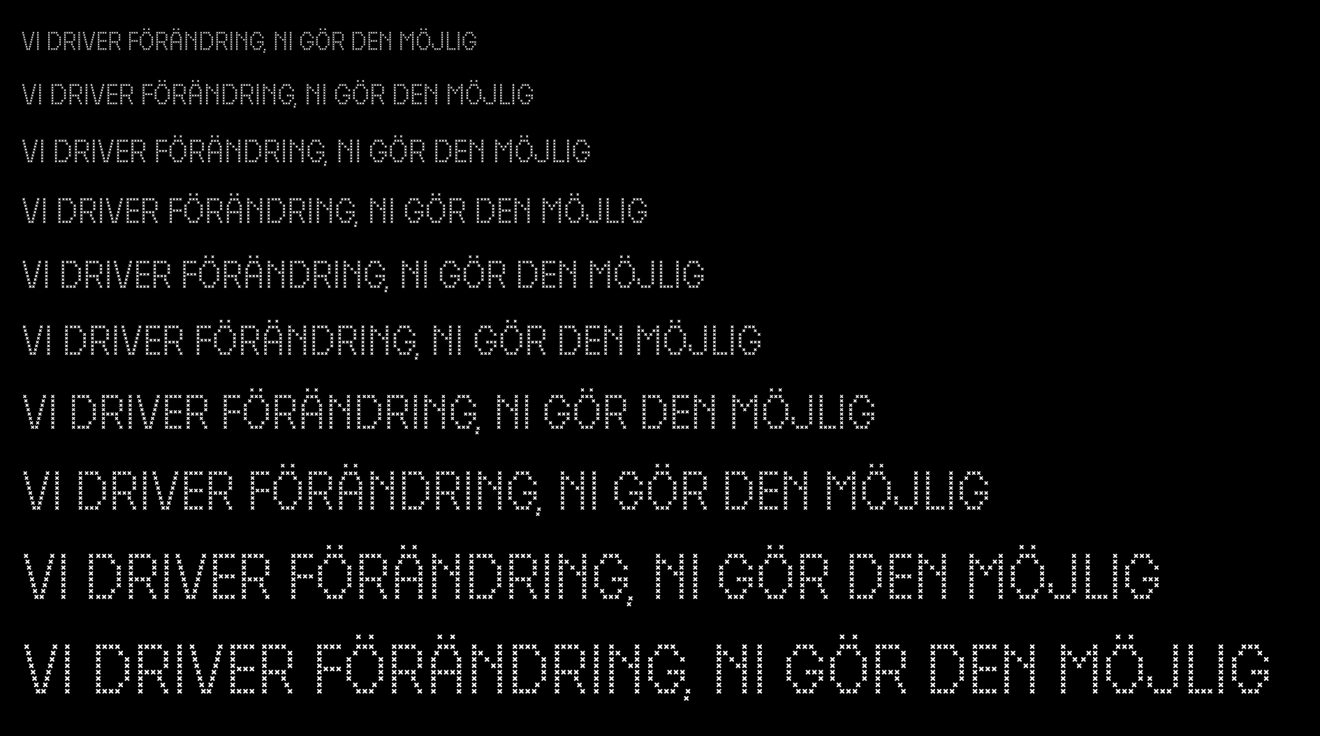
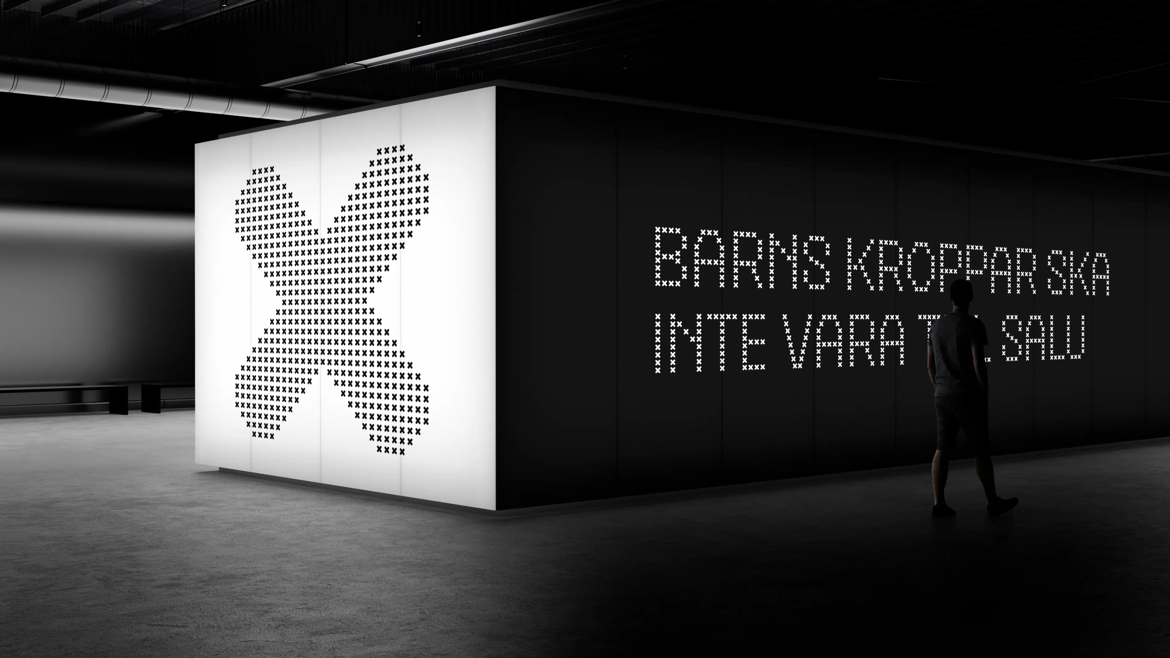
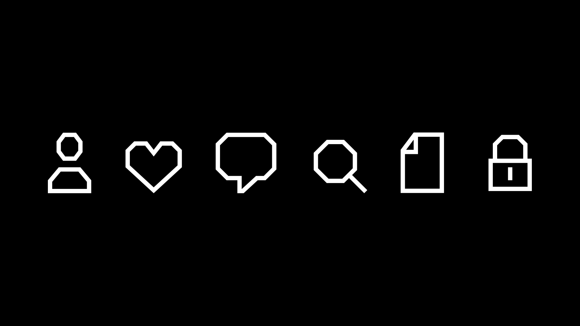
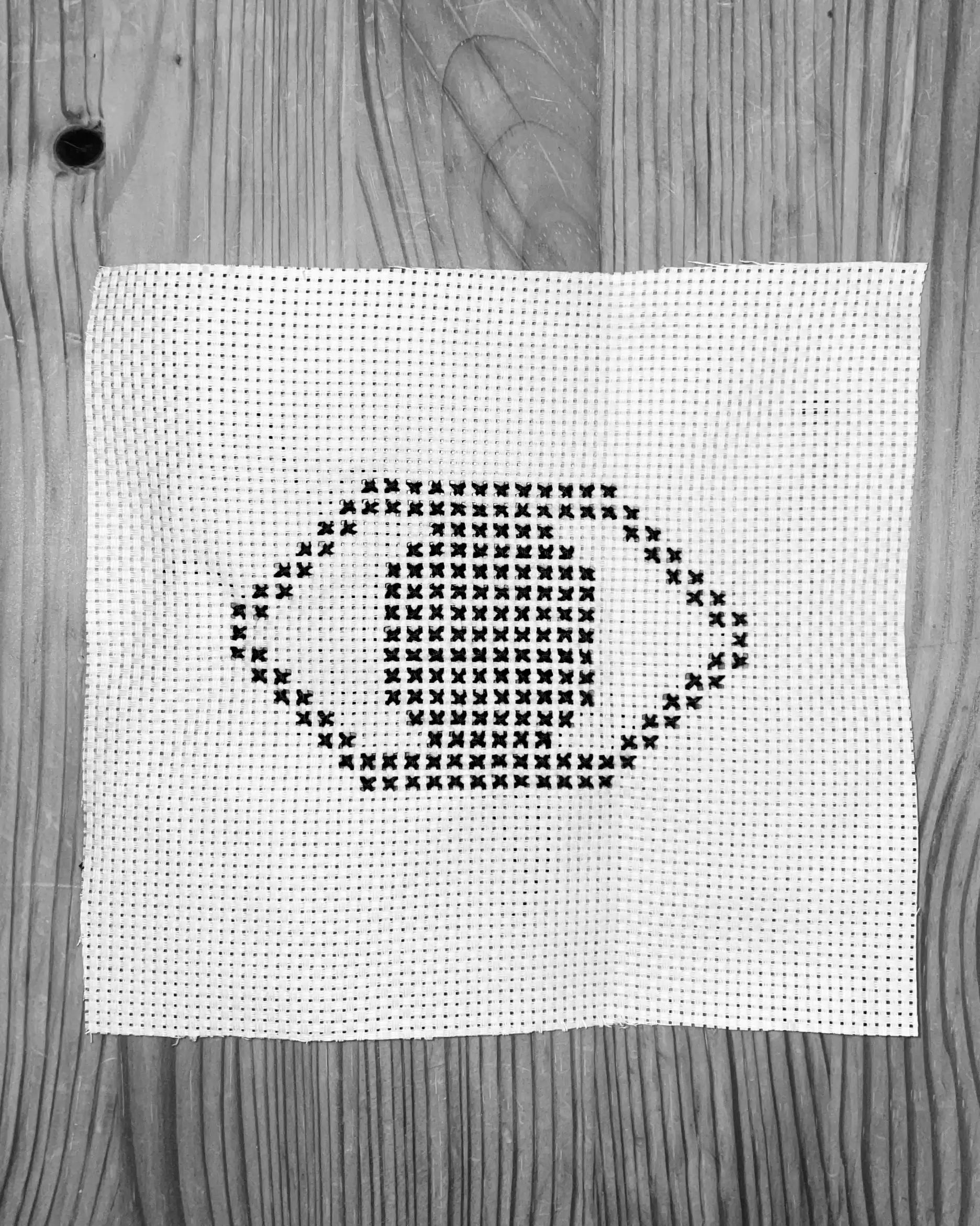
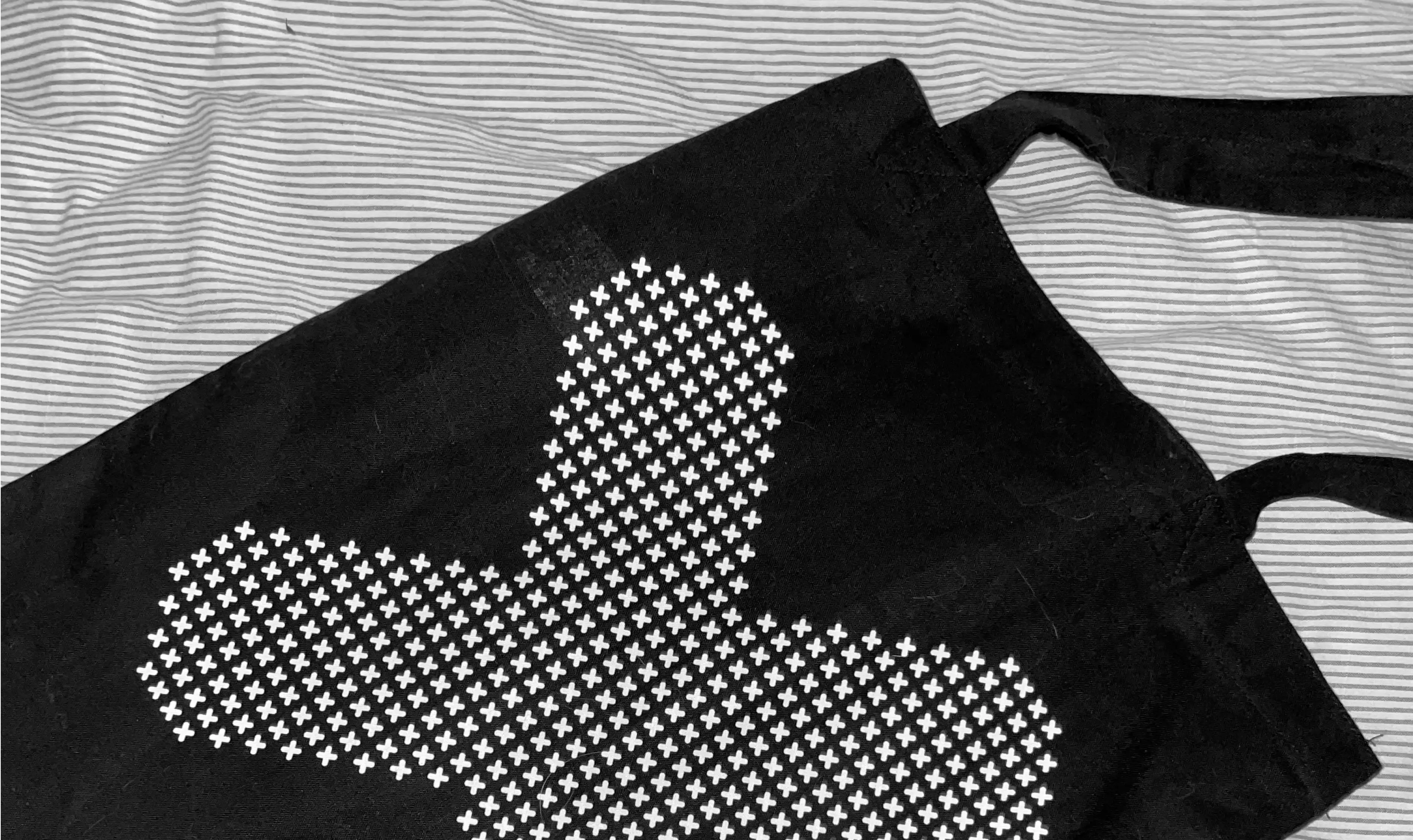
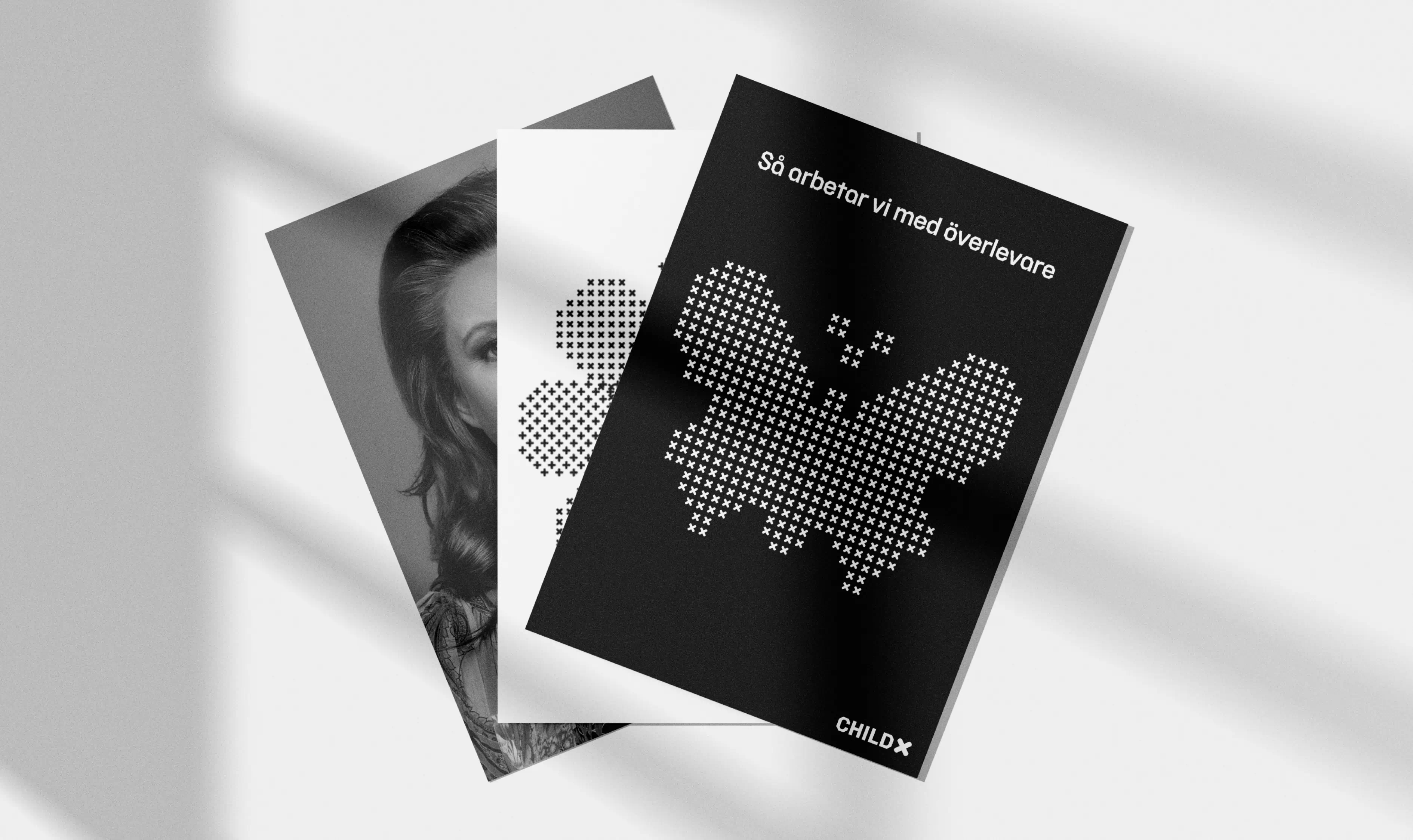
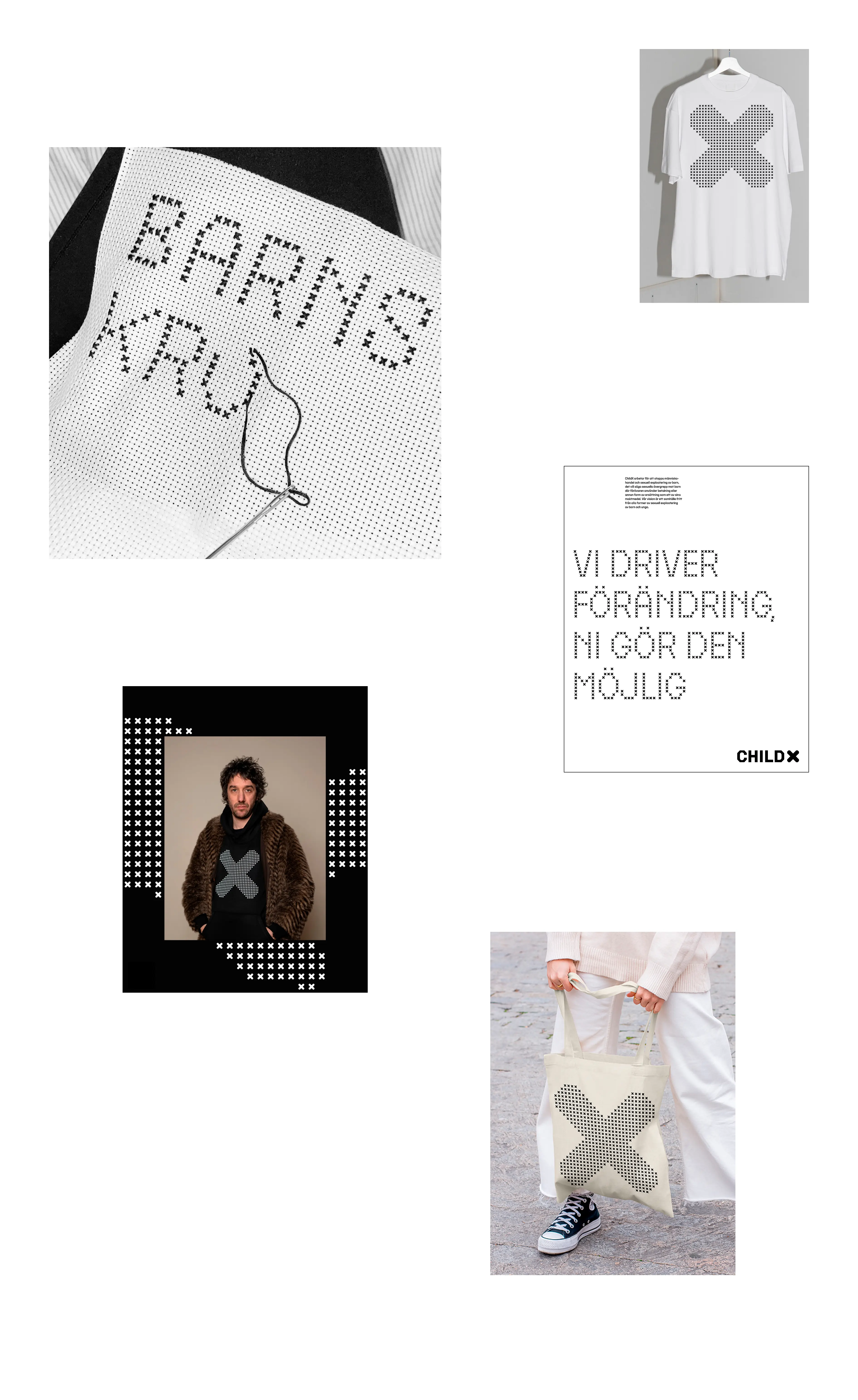
With the X as a starting point we created a visual identity that has the power to both communicate “stop”, hidden statistics and people working together to achieve change. The X is present as part of the logotype, but also directly as the custom pixel typeface and as illustrations. The cut shape of the X is found in both the custom regular typeface and in the iconography. With this new visual identity, the message from ChildX becomes clear and the important work of the organization is highlighted.